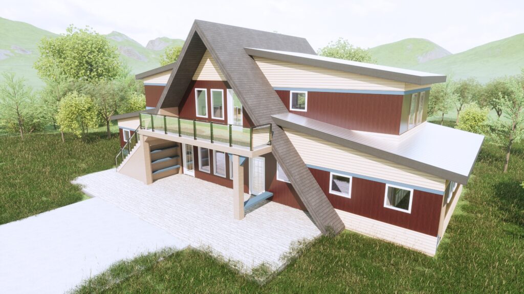
Time has brought about an advent of architectural styles that vary by designer, region, cost, and a multitude of other factors. However, one style outperforms all through its ability to contrive a detailed and consistent visualization of itself through its name alone: The A-Frame. The A-Frame not only resembles a nostalgia we have yet to experience, it also conceals a cluster of creativity within its design and engineering practices. To uncover the magic hidden within the familiar triangle, it is important to first examine the events that led to its public notoriety.
Following the triumphant end of World War II, a seed bloomed inside the average middle class American. An agenda — with equal parts want, need, and a dash of desire — fueled a mindset of owning seconds. A second car, a second fridge, and most importantly, a second home. At the beginning of the baby boom, more of the general public began seeking out a vacation home due to a narrative encouraged by advertisements, storefronts, and magazines. The idea of leisure in one’s lifestyle ignited an uprising in the vacation aesthetic, flooding the design homefront with ways to rethink the cabin and cottage.
As traction grew in the 1950s, the A-Frame began to boast its adaptability in any setting. Even when placed in various surroundings, from mountainous slopes to coastal shorelines, the structure retained a universal familiarity — an aesthetic that was complemented by its uniqueness, affordability, and ease of construction. Ordinarily, if two roof pieces were placed on the ground, pushing against one another, it signified a hut, a shed, a farming storage, or a peasant’s quarters, but this newfound acceptance of the simple shape denounced its stigma. The A-Frame boom was further sustained by lumber yards, the building industry, and postwar architects, who breathed new life into the structure we know today.
In home design, the idea to slanted exterior walls, suggesting an implied fate of falling, must allude to a greater benefit. The schematic design process for an A-Frame begins with the determination of what spaces to include where the slanted ‘roof walls’ intersect each gable end wall. Essentially, we are asking: “what rooms in this dwelling are to make a statement?” First to the finish line is typically the general living and gathering space, shortly followed by the primary suite. Each space leaves the user with the intimate sentiment of belonging within the sloped walls, swapping out commonality for adventure. Rooms where straight and plumb walls are most necessary become positioned away from the sloped walls, and include the kitchen, bathrooms, storage areas, and closets. An A-Frame design asks one to step out of their comfort zone, challenging our senses and igniting innovation in the residential architecture community. In addition, the structural mechanics of the A-Frame are equally unique.
If time rewound back to the prehistoric ages, where homes were either a simple shelter or a spacious cave, building in the shape of a triangle would prove wiser than that of the common square. Fundamentally, the triangle is the most stable shape. Within an A-Frame are sloped roof rafters, attached at each end through nails or bolts to a bottom horizontal floor joist. The connection of these three structural components (top-left rafter, top-right rafter, and bottom floor joist) create a primitive truss and institute an elegant solution in strength. However, this noble configuration faces a major opponent: the typical lumber length needed to assemble the triangle without splicing exceeds the conventional length stocked at lumber yards. Although it is standard practice to splice rafters under structural supports, doing so in an A-Frame unravels its inert stability found through the connection of these three members. An unspliced rafter that is secured to a floor joist will satisfy its desire to push itself away from the structure (thrust) through its connection to the floor joist. A spliced rafter will degrade this stability and will require further structural detailing to relieve its rebellious state. Despite a healthy dose of benefits, the A-Frame has not found its way into modern culture alongside other common residential architecture trends.
Many of us live inside a product, not a home. These two words have substantially different meanings — built with or without the homeowner in mind. The construction practices for an A-Frame can follow a path of non standardization and demand creativity for maximizing the interior space inside. Such complexities reduce its selection in the marketplace. An additional barrier to the acceptance of the A-Frame is its perceived natural setting. The average consumer visualizes an A-Frame on a mountainside, at the end of a serpentine road, without even the scent of another house in sight. They don’t picture it next to a townhome or sitting on a busy side street in the city. Rather, they tell the story of a metaphorical unicorn; a sight only seen during a rare road trip vacation. However, Asheville is home to mountains that can warmly embrace the A-Frame, this familiar friend of the foothills. Coupled with the ever changing state of residential architecture, perhaps the benefits of the triangular structure will create a shift in public perception. Where once the A-Frame was strictly meant for recreation, it can instead be a home.
Paper Fox Collective is led by Scott McGehee, a licensed professional engineer with a passion for home design. Through the combination of his knowledge and experience in the fields of residential design and structural engineering, Scott is able to provide a practical and effective design solution. Check out a few of Scott’s A-Frame designs that breathe life into the iconic style, adding practicality and applicability into the familiar shape. www.paperfoxcollective.com


